Yesterday we re-filmed the performance section of our music video with Jess Cooper. The filming went well; we managed to film a variety of shots with lots of close ups which will be used to create a like-able and relatable artist for our young female target audience.
Today we are going to work on editing these new clips into the narrative parts of our music video.
Thursday, 20 December 2012
Thursday, 13 December 2012
Time management update
We are planning to re film the performance sequence of our music video on wednesday 19th of December. We have decided to return to our original casting of Jess Cooper to play the role of our artist as she is available on this date and having a actor from outside our group will mean that all members of our group will be able to focus on filming and roles behind the camera.
 According to our time management plan we should have finished editing and moved onto to digipak developement. To insure that I do not get behind on work we have finished all editing on the narrative aspects of our video and this week I have made an early start on digipak and magazine reseach. We will film next wednesday then spend that afternoon and thursday editing the new content into the video.

Digipak analysis: Eliza Doolittle
The second digipak I am going to analyze is the self titled debut album by Eliza Doolittle, an indie pop artist with a young teenage female target audience.
 The image on the front of the CD is very busy and fun with a bright fluorescent colour palette that appeals to a young target audience. The images are very entropic and imaginative creating a fun, exciting artist image. The images make reference to Eliza as an British artist with images of famous London landmarks like Big Ben. These are an example of how the cover is creating a recognizable brand image brand image. The image of Eliza is very entropic with her in size proportion with the buildings. This is presenting her as important with a celebrity status that many record label demand in promotional media products in order to create a memorable brand image. There is a lot of movement on the front cover with Eliza's pose, the blue sky and clouds and the erupting volcano. The collage of so many images creates a really exciting and intriguing CD cover which positive tone would appeal to its young target audience.

 The inside of the digipak shows a close up shot of Eliza on the front inside pane. This close up is used to create a strong artist image and to build a relatable relationship between the artist and the audience according to Goodwin's theory. Inside the digipak the bright colours and fun tone has been continued creating a continuous artist and album image. The Cd design is very simplistic with the artist and album name printed in a striking, feminine coloured font. The repetition of the name is making the brand recognizable which is extremely important as this is a debut album. The pink colour and simplistic, striking design would really appeal to a young female audience.
 Behind the CD on the rear inside pane there is a stenciled image of Eliza's face. The shot is an extreme close up further supporting and demonstrating Goodwin's theory that close ups are often demands of record companies in order to create a strong artist identity.
The fold out within the digipak contains lyrics in a hand written font which add a personal aspect that greatly appeals to a young target audience. The focus on lyrics and lack of images balances out the close ups seen on the exteriors of the digipak. This focus on lyrics really appeals to a pop indie audience as they like to see that the music is an extremely important and dominant aspect of their artist image. The pastel blue background of the album cover has been continued in the booklet adding to the consitent sense of continuallity.
 The rear pane of the digipak shows a long shot full length view of Eliza surronded by the track listing of the album. The image of Eliza places a focus on Eliza's legs making it a quite voyeuristic shot; a representation typical of the pop genre.This is an example of Goodwin's theory that music videos and music media products have: 'frequent references to the notion of looking and particlularly voyeauristic treatement of the female body.'
The varieying black and white fonts surronding Eliza's figure give the image a eccentric and quirky feel that would definately appeal to the target audience. The overall mixture of fonts, images and colours throughout the whole digipak create a brand motif and memorable mise-en-scene.
The CD has extra digital content when inserted into a pc; creating a digital, interactive aspect to a Cd creates a digipak which really allows the audience to interact with their audience and creates a strong appeal for a young technology interested audience. The extra content includes behind the scenes videos, picture gallerys and wallpapers. The behind the scenes videos in particular give the audience an exclusive and important feeling which makes the artist, the albuma the overall brand likeable.


 The inside of the digipak shows a close up shot of Eliza on the front inside pane. This close up is used to create a strong artist image and to build a relatable relationship between the artist and the audience according to Goodwin's theory. Inside the digipak the bright colours and fun tone has been continued creating a continuous artist and album image. The Cd design is very simplistic with the artist and album name printed in a striking, feminine coloured font. The repetition of the name is making the brand recognizable which is extremely important as this is a debut album. The pink colour and simplistic, striking design would really appeal to a young female audience.
 Behind the CD on the rear inside pane there is a stenciled image of Eliza's face. The shot is an extreme close up further supporting and demonstrating Goodwin's theory that close ups are often demands of record companies in order to create a strong artist identity.
 The fold out within the digipak contains lyrics in a hand written font which add a personal aspect that greatly appeals to a young target audience. The focus on lyrics and lack of images balances out the close ups seen on the exteriors of the digipak. This focus on lyrics really appeals to a pop indie audience as they like to see that the music is an extremely important and dominant aspect of their artist image. The pastel blue background of the album cover has been continued in the booklet adding to the consitent sense of continuallity.

The varieying black and white fonts surronding Eliza's figure give the image a eccentric and quirky feel that would definately appeal to the target audience. The overall mixture of fonts, images and colours throughout the whole digipak create a brand motif and memorable mise-en-scene.
The CD has extra digital content when inserted into a pc; creating a digital, interactive aspect to a Cd creates a digipak which really allows the audience to interact with their audience and creates a strong appeal for a young technology interested audience. The extra content includes behind the scenes videos, picture gallerys and wallpapers. The behind the scenes videos in particular give the audience an exclusive and important feeling which makes the artist, the albuma the overall brand likeable.
Tuesday, 11 December 2012
Digipak and CD research: Florence and the machine
Digipak and CD research of artists in chose genre: Indie/Pop
The first artist I am going to look at is Florence and the Machine and her album 'Lungs'.
Florence and the machine is an indie/ pop artist with a quirky and eccentric artist image.


 The booklet within the Digipak contains entropic images of Florence. The images are very original and eccentric making them a typical visual convention of the indie genre. WIth the images also come lyrics from the songs on the album, supporting Goodwin's idea the visual reflect and emphasise the artist's lyrics.
The composition of the back pane is dominated by a diagram of human lungs. THis image reflects the name of the album is a visual motif seen throughout the digipak. This is an example of a coherent and consistent brand image being created. The monochrome palette of this pane contrasts with areas of colour in the digipak especially the CD making this the focus of the digipak. A visual technique that suggested the music is the most important aspect of the brand. This focus would really appeal to Florence's target audience as they really care about the quality of the music more than the more visual aspects that are typically focused on in the mainstream pop genre.
At the bottom of the rear pane there are links to the artist's website and instruction that say: 'Insert the disc into you computer to unlock bonus content'. This interactive features makes the artist seem really relatable and the purchased CD very personnal. The digital aspect of the digipak really targets and is appropriate for Florence's young target audience as the internet is such a big part of teenage life. When the CD is inserted into a computer you are directed to Florence's website on which she uses her blog to communicate and interact with fans. This is exposing her target audience to a very direct interaction with Florence and merging to promotional media platforms: digipak and social media into one.


Print reseach
In my coursework I am going to create a magazine album advert for my artist. I want to carry out some research into similar artists in order to understand how images, font and other features are used to create a genre appropriate advert that will appeal to our artists target audience.
The first advert I am going to analyze is this single magazine page promoting the release of Lana Del Rey's debut album: 'Born to die'. Lana Del Rey in an indie pop artist like our artist Nina Nesbitt. Her image is quirky and retro with large references to old hollywood in the clothes she wears and the way her hair and make up is styled.
 Use of images- The image is very simple with the focus purely on Lana's face. They symmetry of the pose and simplistic framing really draws attention to Lana's beauty presenting her in a slightly voyeuristic manner which is typical in the pop genre. This symmetrical and direct framing is quite entropic making the advert striking. As I have mentioned Lana's look is very vintage hollywood; the styling is very in keeping with this mise-en-scene with the wavy hair and vintage make-up. The look of the advert also has stylistic references to America with the western style shirt Lana is wearing and the idyllic blue sky in the background. The representation of Lana del Rey in the advert is very redundant as it is typical for her indie/pop genre. The portrayal creates a strong recognizable, beautiful image (often demanded by the record label) that creates a visual style. Establishing this look is essential as this is Lana Del Rey's debut album.
The font used in the advert is very simplistic but striking. All of the text is in capitals and the contrast in colour between the text and the background really make it really stand out. The central placement of all the text makes the advert noticeable and striking. The colour palette of the text works well with the images. The calm blue and white colour palette creates a calm feel that relates and references the sound of Lana's music.
The text in the advert contains critic quotes which present the album as an acclaimed 'Sensation'. Quotes like: 'The years most eagerly awaited debut album' and 'A sensation' create a clear focus on the music rather that Lana as a personality. This is typical of the genre: Indie/pop. The image of Lana draws attention to her appearance, a very pop genre typical image, whilst the critic comments bring focus to the music a technique used frequently in indie and less mainstream album adverts. This combination of genre conventions creates a artist image that would appeal to a wide audience of different music tastes. Lana's primary audience is young people interested in indie pop music. I feel that the advert would target both men and women because of the focus on appearance. The vintage retro mise-en-scene would also appeal to young people as this look is a very current trend.
The full page magazine advert is an example of Lana being promoted across various media platforms giving the artist a wide spread exposure.

The next advert I want to analyze is the magazine for Florence and the Machine's album: 'Lungs'.
Like our artist Nina Nesbitt, Florence and the Machine is an Indie/pop artist. Her target audience is young indie/pop/rock interested people. Like Nina and also Lana Del Rey, Florence's vintage image appeals greatly to young women whilst the alternative rock aspects of her music make her brand appealing to a wider, less gender specific audience aswell.
The image is very entropic; the pose (which presents Florence with her eyes closed and face turned to this side) is very unexpected for a pop artist. The unusual styling with the strange lungs in particular also create an entropic image. This entropic, quirky representation is very typical of the indie/ pop genre; it would appeal to Florence's target audience as it is not to polished or mainstream. Andrew Goodwin suggests that close up shots are often demanded by record labels in order to create a strong, recognizable artist image. I feel that this definitely the case for this advert. The lack of eye contact with Florence could have made her seen distant but the close up shot and framing create a more personal, relatable tone. The mise-en-scene and lighting of the advert is quite dark juxtaposed with the feminine and delicate pink flowers. This creates an interesting hybrid of visual style typical of the indie/ pop genre. This look will definitely appeal to Florence's target audience.
The font used for the artist name: 'Florence and the machine' is the font used constantly on Florence and the machine albums, posters, adverts etc. This is an example of a visual brand motif. Goodwin says that record companies often use visual motifs in order to create a consistent and recognizable brand image. The style of the other font is very traditional and varies making the advert look quirky and eccentric. This is in keeping with Florence's image therefore appealing to her target audience and fans.
The text used in the piece is brief with the artist name, the album title, the release date and the ways in which it will be released. The mentioning of various release forms would appeal to an indie/ pop audience especially the inclusion of 'vinyl'. This traditional release is in-keeping with the audience's quirky, vintage and often eccentric interests.

The final magazine advert I am going to analyse is 'The Family Jewels' By Marina and the Diamonds'. Like Nina Nesbitt, Marina and the Diamonds is a pop/indie artist. She also has a very similar target audience of young teenage women because of her quirky, exaggerated vintage and doll like image and combination of pop sound with darkly humorous lyrics. These features of her brand identity really make her an effective and appealing combination of mainstream pop with a more quirky style and sound make her really appealing to this audience demographic.
The close up image creates a personal closeness with the viewer whilst the unexpected horizontal pose by Marina makes the advert entropic therefore working with the quirky brand image. Close ups according to Goodwin are often demanded by the record company in order to create a recognisable and relatable image. This is something we definitely want to achieve for our audience in order to appeal to our young female target audience.
The image of Marina has been photoshopped quiet thoroughly giving her face an artificial and doll like appearance. This representation is a reference to hollywood and glamour images with the photoshop editing and voyeuristic pose. This kind of mise-en-scene which draws great inspiration from hollywood and americana is a visual brand motif for Marina and the diamonds, with many of her lyrics based on the trials and nature of fame and fortune. This is an example of Goodwin's music video theory that visuals reflect the lyrics being portrayed and used on a variety of promotional media platforms not just music videos. The representation which is so dramatised and exaggerated is also an example of how the advert heightens this pop genre typical representation so much that it becomes quirky and entropic and very Indie.
The floral background is very vintage and antique looking and in keeping with the overall quirky mise-en-scene that appeals greatly to the young artistic female target audience.
The text used in the advert is very entropic with its dominance over the whole composition of the single page. The white, what looks like handwritten, writing is very striking and attention grabbing. A technique typically and frequently used in promotional magazine adverts.
Like the Lana Del Rey advert, this advert also has critic qoutes that present an esteemed and acclaimed identity of the artists music. The quotes used read: 'Sparkling pop with beautiful darkness for a debut album' and 'The queen of maverick pop'. The quotes really highlight the genre conventions of her music with the combination of 'sparkling pop' and 'darkness'. The second qoute really reinforces the idea of a important and respected star image with the use of the word: 'Queen'. This use of idolising vocabularly is used frequently in the pop genre and often requested by the record label to create a superstar celebrity image.
Friday, 7 December 2012
Time management update
Thursday, 6 December 2012
Audience Feedback Focus Group
Today we have done an audience feedback focus group. We asked four people who fit into our target audience to watch our rough cut and to answer the questions we have prepared. Here is the video showing their answers.
We have received positive feedback from the group. They said they thought our music video was appropriate for our genre because: 'It had lots of shots that matched with the music'. This a very positive comment as it suggests that we have created an effective narrative that abides with Goodwin's theory that visuals reflect the music. This is something we definitely wanted to achieve and focused on this with frequent shots which visually represent the lyrics e.g. the glue. THe group also felt that it suits the genre because some of the shots are quite 'entropic', 'things you wouldn't expect' and 'quirky'. This means we have effectively communicated the quirky, light hearted tone we were hoping to portray.
Creating like-able characters and most importantly a relatable artist has been one of the focuses of our music video productions. We asked the focus group if they felt they could relate to the artist and they said 'she looks friendly' and that the close up shots were 'connecting'.
In our video we cast young girls as the characters to hold the lyrics on card. We wanted to do this in order to create a relatable, unified tone for our target audience. Our feedback group have responded positively to this aspect of the video. When asked if they felt our music video appeals to our target audience one audience member said: 'yes because you showed people the same age (as the target audience).' They also felt that the 'girly cupcakes' would appeal to 'that age group and gender'.
We asked our focus group if they felt any improvements could be made. Here are some of their comments and suggestions:
'More performance and more movement in the performance'
'She's mostly just sat down so maybe you could show some different levels'
These comments really focus on the performance aspect of our video. I think it is a good idea to maybe introduce more performance as suggested in order to create a good, even balance between narrative and performance. It is also a good suggestion to introduce a wider variety of shots in order to create an even more relatable portrayal of our target audience.
Overall our audience feedback focus group has been really successful and useful. It has allowed us to understand our target audience through their response. The feedback has also gave us some really good ideas on how to improve the performance section of our video. We may now have to consider re-filming some of these performance shots.
Rough Cut
We are going to do a feedback group with people who match our target audience demographic in order to see how they react and receive the video. We hope that the video will allow us to understand our target audience more. We hope to gather comments and suggestions that will allow us to make improvements so our video that will please and appeal to our target audience.
These are the questions we are going to ask.
Why do you think this music video is appropriate for our genre?
Do you feel you can relate with the artist and why?
Do you think the video appeals to our target audience? Why?
Are there any improvements that can be made?
Any other suggestions or comments?
We have based the questions on target audience and genre as we really want our music video to suit these aspects. We have also based questions on ideas and suggestions the target audience group may have as this may be a great opportunity to hear some really original ideas. Developing some of these ideas and comments will also add to the unified tone and the strong audience/ artist relationship we are trying to create.
Thursday, 29 November 2012
Editing and time management update
Today we have been editing our music video on 'Final cut express'. We have been following our storyboard to create our planned sequence of shots.
We want the cutting of our music video to be fast paced, emphasising and reflecting the upbeat sound of the song (and also abiding by Andrew Goodwin's theory that the music and visuals are linked in a music video).
In these early stages of the editing production we have focused on creating a rough cut which allows to select the shots that will make it into our music video. An example of the selection process is demonstrated in picture 2; whilst filming we often filmed multiple style numbers for the counting sequence so today we have been faced with the task of choosing which numbers to use. We have decided to go with the four with the purple background as we feel that the feminine pastel colour will work well with our overall mise-en-scene and appeal to our female audience.


We have also made similar decisions on different shot types to use out of the variety of performance shots we filmed. We have decided to discard most of the performance shots which are long shots and have decided to use the various close up shots instead. We feel that close ups of our artist will create a much more relatable artist image for our audience and will clearly present our artist in a protagonist role. (a characterisation typical of our genre)

Here is my time management table for November. It states that by the end of this week we should have completed a rough cut. I feel that we will easily achieve this target as today we finished roughly editing together our shots. In tomorrows lesson we will work on adding the audio and configuring the timing between the song and the visuals of our music video.
Creativity

What is creativity?
The dictionary definition of creativity is: 'the use of the imagination or original ideas, esp. in the production of an artistic work.
How can we be more creative?
In order to be more creative we need to continue to learn and explore new ideas. Learning about new things can often spark new ideas. Research into an idea or brainstorming an idea can also help us become more creative. TO become more creative and come up with ideas we need to be inspired by others using their idea as a stimulus and merging with your own ideas.
Where does creativity come from?
Creativity is a natural ability that everyone has. It is however argued that education increases creativity.
Creativity plays a huge role in the production of media. The success and originality of the aesthetics and functionality all depend on the creativity of the idea. Creativity is used throughout all aspects of the the production; in primary ideas, decision making and evaluation. The level, use and refining of creativity in the production of a media product are all vital in order to achieve a successful finished product.
This video by 'How Cast' suggests that there are 5 steps that must be take in order to become more creative. The steps are:
1. Sleep- Scientists have proven that the REM sleep cycle improves creativity and problem solving.
2. Exercise- Exercise stimulates creative thinking
3. Daydreams- The video explains that whilst allowing the brain to wonder many great creative ideas are realized.
4. Continuous education- Learning new things can help you come up with new ideas
5. Challenges- putting the brain in nerve-racking situations stimulates creativity.

I personally agree with the education point. I find that I am most creative and come up with new ideas when I am exposed to new information or the ideas of others. One idea that is not included in the piece which I personnally find creatively stimulating is looking at other visual sources. I often find inspiration by looking at visual products like magazines, books, and TV programs.

Friday, 23 November 2012
Costumes
Our chosen mise-en-scene for our video is very vintage, feminine and whimsical look. We feel that this feminine image, with a vintage quirky edge, will appeal to our target audience of eccentric, creative and fashionable young females. We have began putting together images of costumes ideas for each actress in our video. The clothes are mostly pastel shades and have vintage inspired designs. The costume choices are a hugely important aspect to consider in our planning process as we are trying to appeal to an audience who are very interested in clothes. Good costume choices can be used as a very effective promotional technique for our specific target audience. I have put a board of images together on 'Pinterest'. This allows me to see all of the potential costumes together in order to decide which work well together and successfully create a consistent mise-en-scene that will appeal to our target audience.
Pinterest board:

Pinterest board:

Filming update: Filming finished
We have now completed filming. Yesterday we filmed the performance section for the video which was very successful. We are now beginning to evaluate and choose the shots we would like to edit into our video through the capturing process.
Filming update: casting changes
We have now been filming our music video for three weeks we are on schedule to finish filming at the end of this week. We originally planed for Jess Cooper to play the role of our performer in the music video but unfortunately Jess is not available to film at convenient times for our group. We have therefore made the decision that as a member of the group I will be cast as the performer. Although this is a compromise on our original plans we feel that the change will have advantages as I understand the look and identity we are trying to achieve and I am also familiar with the song and artist.
Monday, 19 November 2012
Filming update
We have been filming our music video for two weeks now. We are on target to finish filming next week. We have completed these shots. I have written small evaluation of problems we came across in filmingsome of the shots:
- Phone:
When we began filming the phone (a very simple shot with little movement) we decided to place the phone in front of a floral background in order to be inkeeping with our overall mise-en-scene that will hopefully appeal to our target audience.
- Phone:
When we began filming the phone (a very simple shot with little movement) we decided to place the phone in front of a floral background in order to be inkeeping with our overall mise-en-scene that will hopefully appeal to our target audience.
- Numbers:
We are really pleased with the variety of different house numbers we found around Ludlow and feel that they will look very effective when edited into a fast sequence.
We are really pleased with the variety of different house numbers we found around Ludlow and feel that they will look very effective when edited into a fast sequence.
- Snakes and Ladders:
The snakes and ladders board we have used is brightly coloured and looks exciting and fun. It therefore works well with the overall tone of our video.
The snakes and ladders board we have used is brightly coloured and looks exciting and fun. It therefore works well with the overall tone of our video.
- Glue
- Tap
- Cupcakes
- Back of heads
- Walking on pavement
- Hat
- Lyrics on cards- Filming the lyrics on cards took a lot of trial and error as we had to make sure the lyrics could be seen and understood clearly. We completed this succesfully and feel that the jump between characters holding the cards will really relate and appeal to our young, female audience.
Next week we are planning to film the performance section of our music video with our actress Jess who will play the part of our performer. We were hoping to film this section on the assembley rooms stage but because of scheduling problems this is not possible. We have worked around this problem and decided to use the smaller stage in the old school room at college. This is availible on the day we want to film and will be convenient as it is in college.
Monday, 29 October 2012
Narrative analysis of chose genre
Narrative analysis of the music video 'We are never ever getting back together' by Taylor Swift.
In the video their is evidence to support Propp's stock character theory. Taylor Swift is presented as the hero through close ups and narrative focus. This representation is typical in pop music videos. It promotes the artist.
The male love interest in the video is a typical stock character in the pop genre, relating to the romantic lyrics. This visual/ lyrical link appeals to the young female target audience. The presentation of the male character in the video, wearing all black and poorly lit, creates an symbolic code making the audience assume he is the antagonist in the narrative. The idea of symbolic codes in narrative is from Barthes theory. The presentation of Taylor in a very bright and floral outfit further establishes her as the hero, this is also a symbolic code within the video.
According to Levi Strauss' theory there are binary opposites in every media text. In this video there are frequent binary opposites referenced: The contrast between love and hate between the couple (this is connoted in a semantic code (Barthes) through light and dark imagery to represent each side of the couple.) There is also an opposition between reality and fantasy through the entropic images of dancing musicians dressed as animals and the cinematography that jumps and pans through various unrelated sets.
The romantic narrative of the video that depicts an 'on/ off' relationship is a very appealing cultural code for the target audience of the vidoe and is therefore typical of the genre.
The video contains the five stages of Todorov's narrative theory: Original equilibrium, distruption, recognition, attempt to restore and new equilibrium.
The original equilitbrium is the opening image of Taylor presented as a typical teenage girl sat at her window. This is a very relatable image of normality for the target audience. The distruption is the entrance of the male false hero. This representation is again relatable for the audience and typical of the genre. The comical and entropic dancing in the chorus is an attempy to restore. This positive image is very typical of the pop genre. There is also a flash back to what a sign shown in the video labels: 'Happy days', this is also a attempt to restore a happy normality.
The new equilibrium is found when Taylor returns to her window. This happy ending for the hero is very typical of the genre; pop videos rarely have negative endings.
How we will use similar narrative features in our music video
In order to establish our artist as a hero and likeable character, we are going to use close up head shots, similar to those used in the Taylor Swift video. Presenting our character in this way will make her relatable to the audience.
In the narrative of our video we are going to use numerous, liminal but relatable female characters who will create a narrative appealing to our young target audience.
Paloma Faith- 'Picking up the pieces' Narrative analysis
The video abides with Propp's stock character theory through the representation of Paloma as a hero character. This is very typical in pop music videos and is suggested through the frequent close ups of Paloma.
.
The male love interest is presented as a false hero, a possible villain and an antagonist character through a symbolic code, similarly used in the Taylor Swift video, that presents antagonist characters in dark colours and poor lighting.
The video does in some ways follow Todorov's theory. The video begins with a very solemn and tense equilibrium when Paloma and the male love interest are in a unhappy relationship. The beginning is therefore already an action code (Barthes) that needs to be reslolved. The unhappiness in the relationship is highlighted by long shots showing Paloma alone and unhappy.
The recognition and disruption occur when the male character loses his temper and seems to give up on the relationship; he is seen aggressively hitting the table and leaving. This is again a very negative representation of this stock character.
The attempt to restore is not very clear in the video. After the disruption and recognition the video just sees Paloma singing emotionally until at the very end of the video the male character returns and kisses Paloma. They then drive off happily into the distance. This is the new equilibrium.
In the video there is evidence of Levi Strauss' theory that media texts contain binary opposites through the opposition of colour and darkness; love and hate; unity and isolation.
Similarly to the Taylor Swift video this video uses frequent close ups to establish the female protagonists as hero stock characters. We definitely want to use this effective narrative feature to make our artist relatable to our young female target audience.
Friday, 19 October 2012
Filming schedule
To insure the filming of our music video will be organized and successful, we have created a filming schedule:
Shots to be filmed on Thursday 25th October
- Phone
- Numbers
- Snakes and Ladders
- Glue
- Tap
- Cupcakes
- Back of heads
- Walking on pavement
- Hat
Shots to be filmed Thursday 8th November
- Lyrics on cards
- Guitar
- Jess performing in assembly rooms
Thursday, 18 October 2012
Locations
Here are our chosen filming locations.
The assembly rooms will be used for the performance aspects of the video. Here is an image of the stage where we will film Jess our performer singing and playing guitar.
We want to show our artist performing in order to present her in a live enviroment that suggested that she is a talented live performer. Seeing the artist performing is a vital part of a music video and a huge convention of our genre. We hope that our artist will be appealing to our target audience through filming in this location.

The market place and the streets around Ludlow will be used for the narrative sections of our video, in which the lyrics are seen on card held be the four girls in our video. The number sequence inspired by the olympic countdown will also be performed around Ludlow. we want to use the town in order to create a relatable feel to the video. We don't want to use eloborate glamourous sets for a music video as we want our artist to seem relatable to our audience like she is just like them. We also feel that Ludlow's small street and old buildings will fit in well with our vintage, quirky mise-en-scene that our target audience will really appreciate.

The assembly rooms will be used for the performance aspects of the video. Here is an image of the stage where we will film Jess our performer singing and playing guitar.
We want to show our artist performing in order to present her in a live enviroment that suggested that she is a talented live performer. Seeing the artist performing is a vital part of a music video and a huge convention of our genre. We hope that our artist will be appealing to our target audience through filming in this location.


The market place and the streets around Ludlow will be used for the narrative sections of our video, in which the lyrics are seen on card held be the four girls in our video. The number sequence inspired by the olympic countdown will also be performed around Ludlow. we want to use the town in order to create a relatable feel to the video. We don't want to use eloborate glamourous sets for a music video as we want our artist to seem relatable to our audience like she is just like them. We also feel that Ludlow's small street and old buildings will fit in well with our vintage, quirky mise-en-scene that our target audience will really appreciate.

Health and Safety: Risk Assessment
|
Potential Dangers
|
Potential
Outcomes
|
Actions to
avoid potential outcomes
|
Further
comments
|
|
Tripping over
pavement in town centre
|
Twisted ankle Not a serious injury but must be avoided |
Wear sensible
footwear, and beware of where we are walking at all times
|
|
|
Filming in a public
place, bumping into other people due to over crowded.
|
This could result in
someone falling over which may cause someone to hurt their ankle or have small
grazes.
|
Choose a day to film
when the market is not there which means, Ludlow should not be to over crowd.
|
Generally beware of
public walking around Ludlow when filming.
|
|
Potential road
accidents such as getting hit by car when filming on the pavement.
|
This could result in
a serious injury such as broken bone, if the car is traveling fast it could
be very serious.
|
Make sure we stay far
away from the edge of the pavement when filming to prevent getting to close
to any passing cars.
|
We should choose to
film in quieter places in Ludlow where there aren’t too many passing cars.
|
|
Weather conditions,
heavy rain means ground will become slippery so it may be easy for someone to
slip. Windy weather conditions means the camera will be less stable.
|
This could result in
someone falling and hurting themselves. Due to the
wind we may drop the equipment and filming will not be as clear as it hard to
film in bad weather conditions
|
Check weather
forecast before recording. If it is wet underfoot, sensible footwear should
be worn to prevent slipping.
|
|
|
When filming in the
assembly rooms it may be crowded if there is a performance on, could result
in someone tripping.
|
This may result in
someone hurting there ankle or getting a graze.
|
Choose a day to film
in the assembly rooms when its not busy and there isn’t a performance on at
the same time.
|
|
|
Falling of stage in
the assembly rooms
|
Could result in a
serious injury such as braking a bone, but this not likely to happen.
|
Make sure everyone is
aware of the size of the stage, and don’t perform to close to the edge.
|
We are only going to
do a small amount of filming in the assembly rooms which means we should
limit the amount of risks which may occur.
|
Time Management
Here is the time management calendar I have created on 'ical'. The calender shows the key tasks that need to be completed for my coursework.


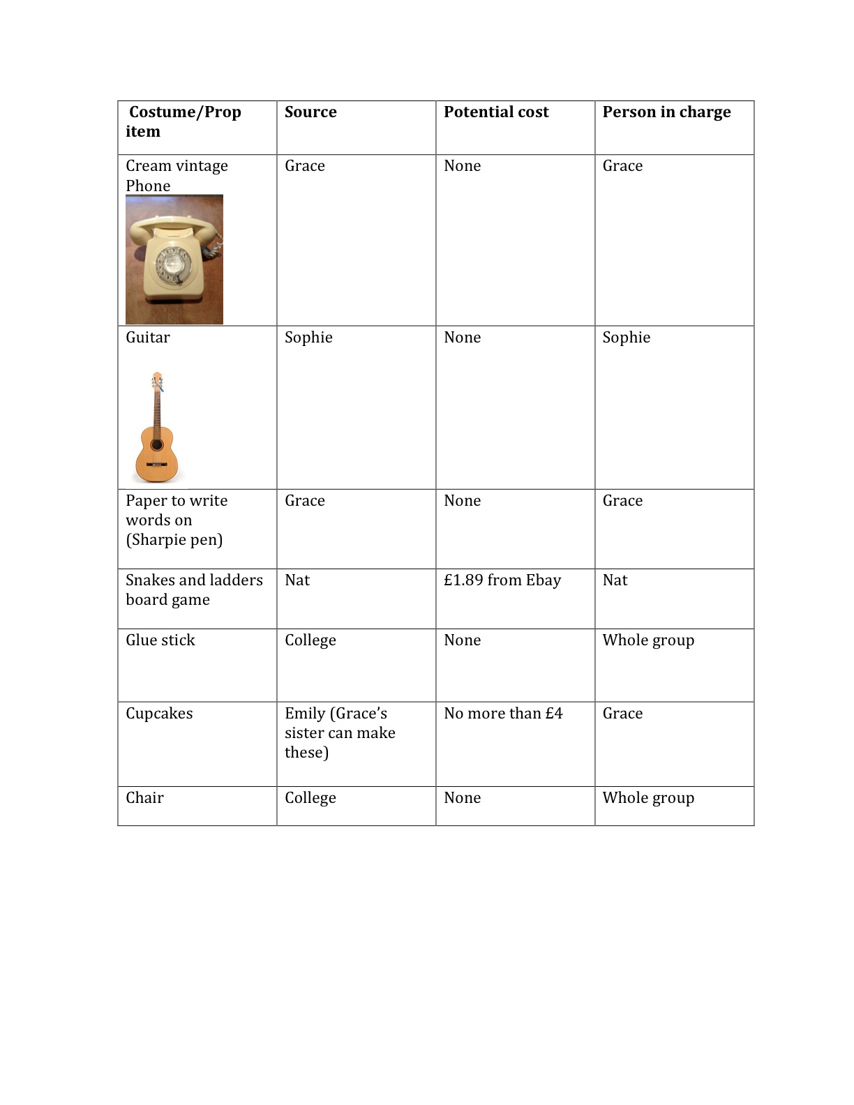
Props
Here is a table showing the props needed for our music video and were we will source them from. The table effectively helps us to organize which member of the group is responsible for which prop. This effective organization will hopefully result in a successful music video.
Thursday, 11 October 2012
Storyboard
Here is the storyboard for our music video created on iMovie. The video storyboard shows the shot types and basic editing of our video.
Pitch feedback
After we presented our pitch to the rest of the class, we carried out a feedback questionnaire. Here are the questions we asked; the feedback we recieved and what we have learnt and gained from this feedback.
1. Why do you think our concept is appropriate for our genre?
'The genre is appropriate to you genre as its quite unique and different which that genre normally tends to be'
'Its quite quirky and different'
'The mood board links well with the kind of music- quite quirky'
'Concept is quite quirky/eccentric-fits in with genre conventions'
The response to this question is very positive; the class seem to understand the relationship we have aimed to create between our concept and 'quirky', 'eccentric' genre.
2. What aspects of our concept do you think will appeal to our target audience?
'Style of clothes'
'The style of the video and how its quite eccentric and very feminine'
'The quirkiness, jumpiness (editing) and fashion'
'Quite a girly music video; this appeals to female target audience.'
'Style of clothes'
'I could imagine students listening to this genre of music.'
From the feedback, we can see that the styling and editing ideas for our video are the features that the class feel will appeal to our target audience the most.
3. Do you feel that our concept presents an appropriate brand image for our artist? Why?
'Yes because the concept fits in with the conventions of the genre.'
'Focus on fashion and style, appropriate branding technique for the artist.'
'Appropriate brand image, very entropic therefore relate well with this genre and individuality'
Again the class had fed back the idea that the 'entropic', eccentric and 'individual' features of our planned mise-en-scene will communicate an effective and appropriate brand image.
4. Do you think our locations are appropriate for our song?
'Yes, genre normally set in a rural, quite area.'
'The busyness of the town and the people on the streets will contribute to the jumpy feel of the video.'
As supported by Goodwin's theory that 'music videos demonstrate typical characteristics of the artist's genre' the class agree that our chosen locations will suit the genre of our song.
5. Do you think our lack of narrative is effective and appropriate for our song, genre and target audience?
'The lack of narrative lets you focus more on the song'
'The lack of narrative makes the video clear and simple'
'It ties in with the abstract nature of the genre'
'Yes as most other video of the same genre have little narrative.'
'It's quirky'.
The class feel that the lack of a clear narrative in our video will be a very effective, 'abstract', 'quirky' and 'clear' feature which will suit our genre and target audience.
The overall response from our questionnaire is very positive and has highlighted some of the ideas that the class particularly like e.g. The styling; the editing; the quirky and vintage mise-en-scene.
Subscribe to:
Comments (Atom)